Personal Branding Development.
Contexts - Ideas
In terms of my personal branding development, through research and concept creation, I have a distinct taste, including: bold type, rustic textures, retro colourways, understated maximalism and the contrast between ‘old and new’.
In terms of my personal branding development, through research and concept creation, I have a distinct taste, including: bold type, rustic textures, retro colourways, understated maximalism and the contrast between ‘old and new’.
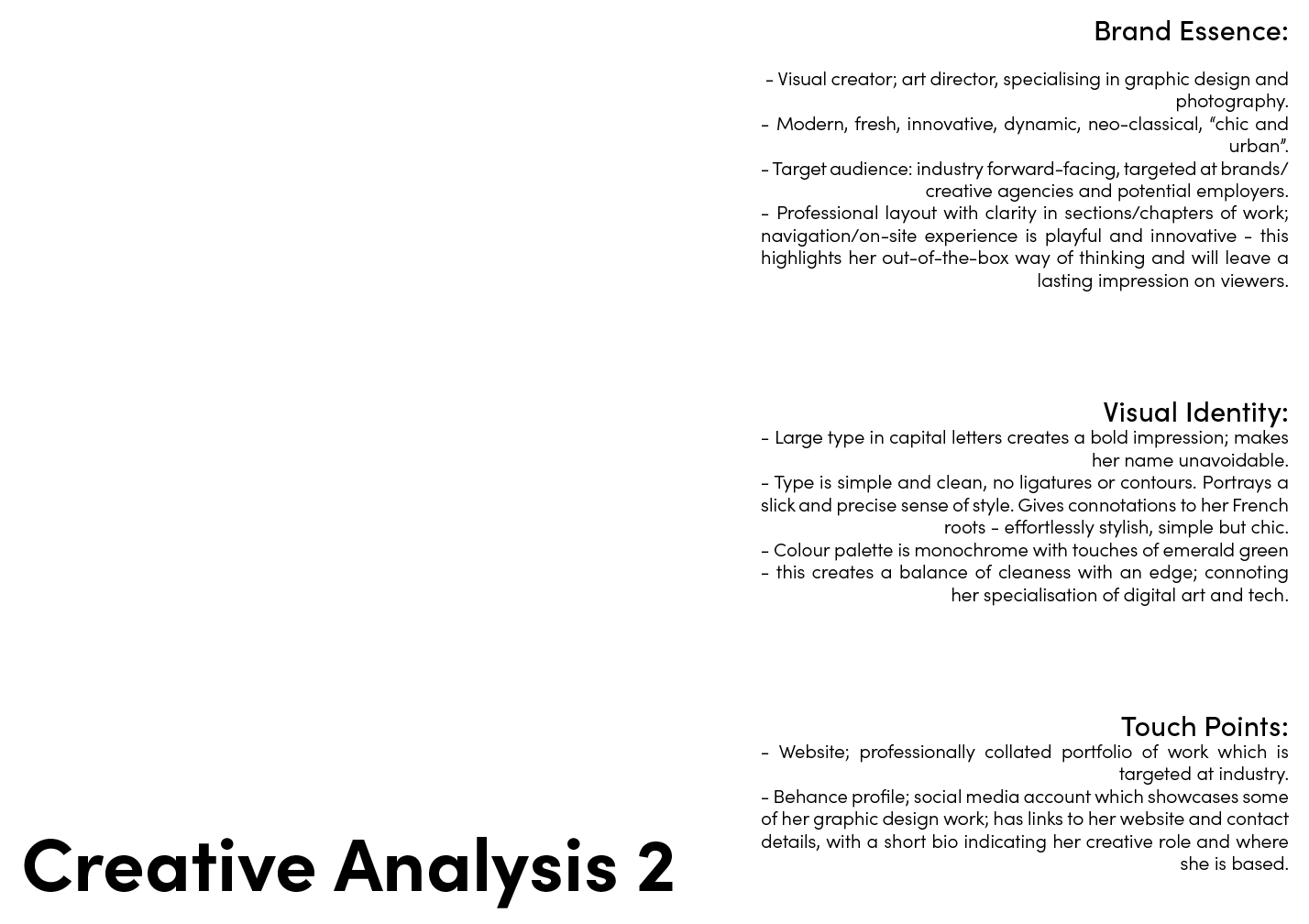
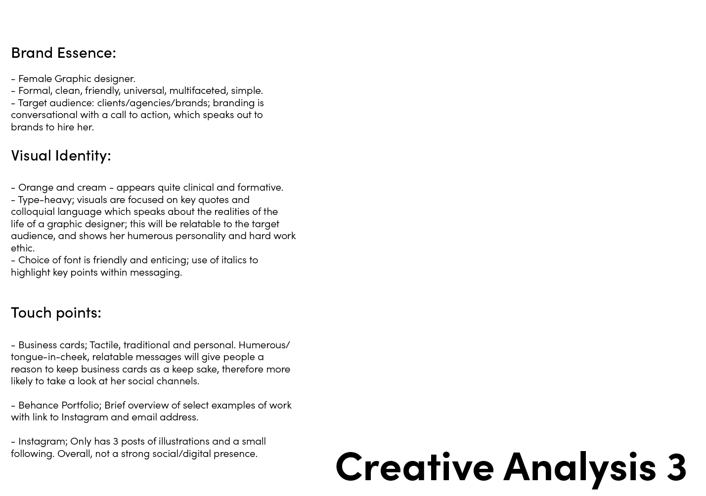
Creative’s Brand Analysis
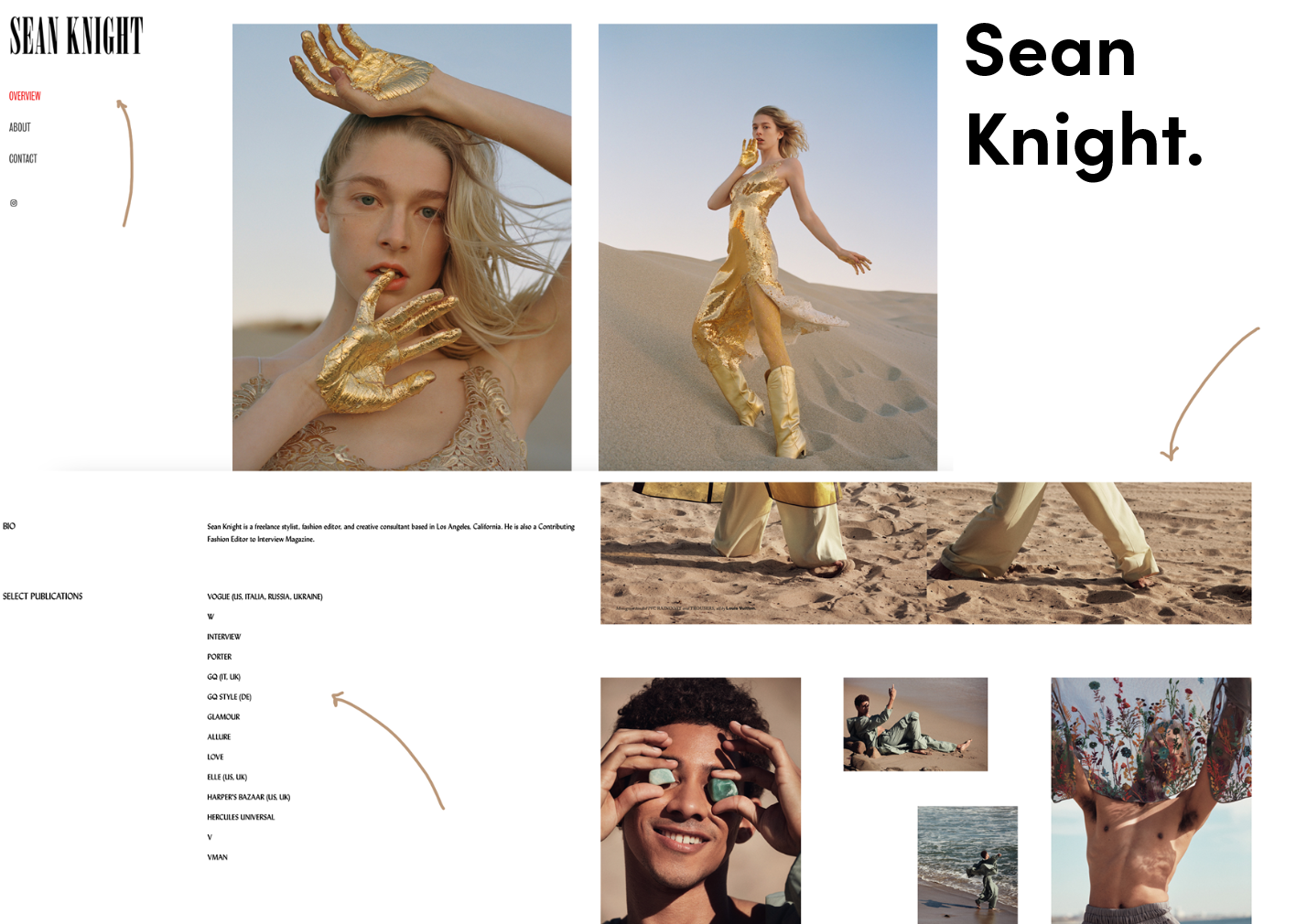
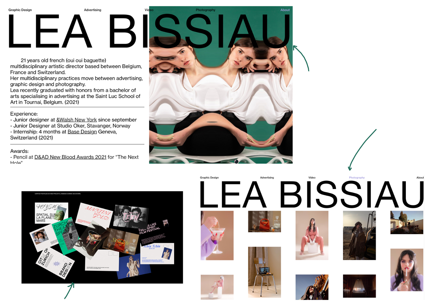
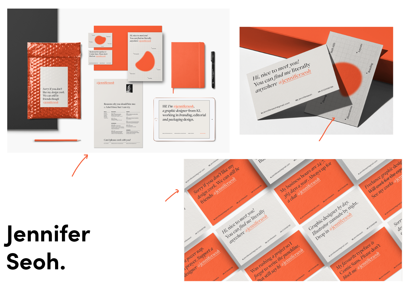
Prior to creating concepts, I undertook an in-depth analysis into an array of creatives, to gain a broader perspective on the potential and inspiration of personal branding.
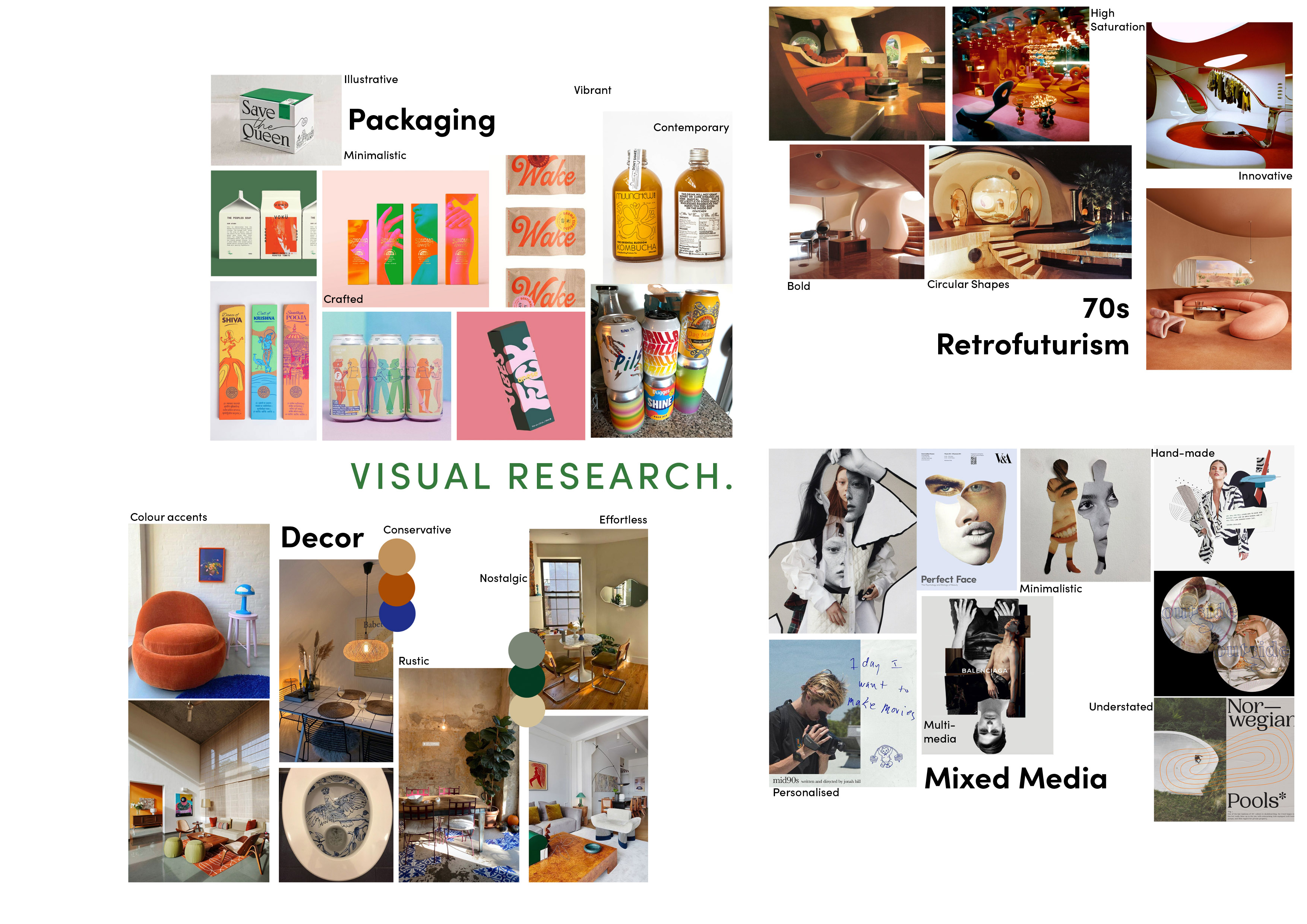
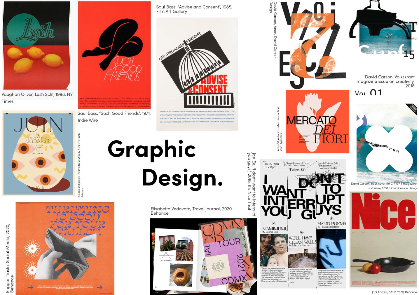
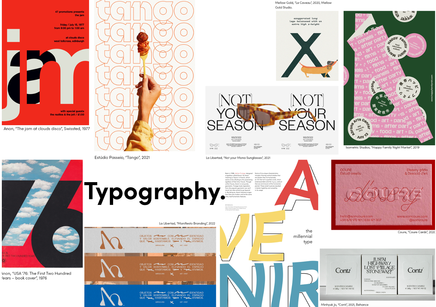
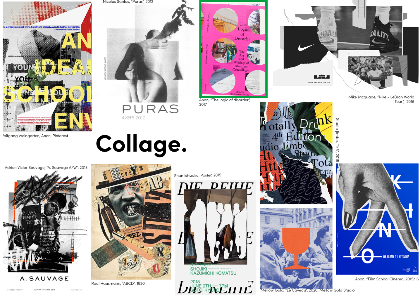
By categorising my visual interests into three themes, ‘Graphic Design’, ‘Typography’ and ‘Collage’ mood boards, I was able to analyse what style of imagery I was subconsciously drawn to. Inspiration was taken from both established and contemporary artists, expanding my knowledge of design work and creating a timeliness to my own visuals, to portray a sense of continuity.
Prior to creating concepts, I undertook an in-depth analysis into an array of creatives, to gain a broader perspective on the potential and inspiration of personal branding.
By categorising my visual interests into three themes, ‘Graphic Design’, ‘Typography’ and ‘Collage’ mood boards, I was able to analyse what style of imagery I was subconsciously drawn to. Inspiration was taken from both established and contemporary artists, expanding my knowledge of design work and creating a timeliness to my own visuals, to portray a sense of continuity.
Ideas ︎︎︎ Concepts
Personal Brand Concept Boards
‘Posh Green Eggs and Ham’
This board showcases my style of visual layout/editorial design. My visuals are often minimalistic, understated, and clean, whilst remaining contemporary in terms of my colour palette and type.
Understated
Minimalistic
Stylish
Sleek
Unpredictable
Editorial
Luxe
Professional
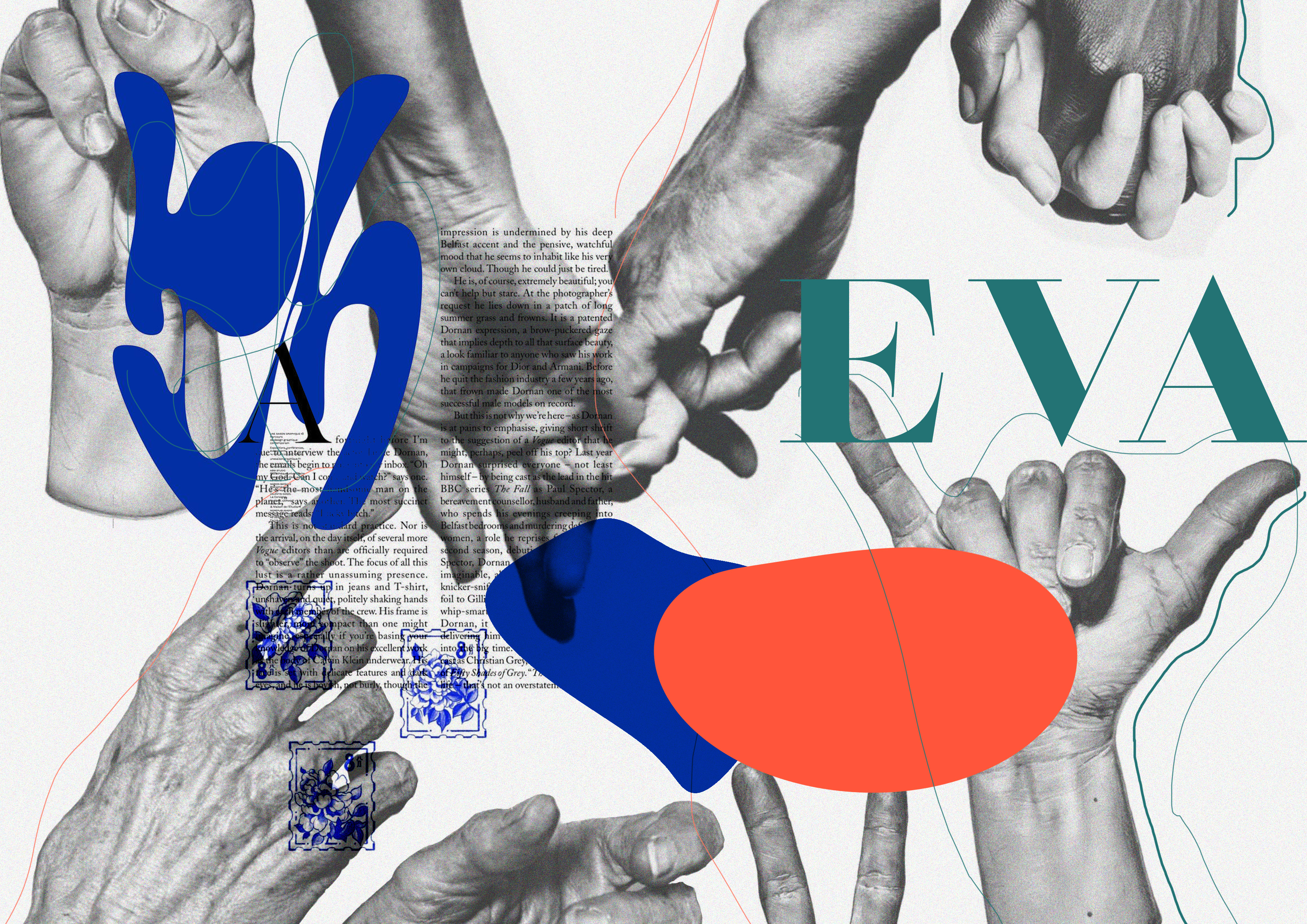
‘Helping Hands’
This board represents my personal style of minimalistic collages, whilst continuing the themes of black and white with accents of colour.
Contemporary
Playful
Bold
Innovative
Multi-media
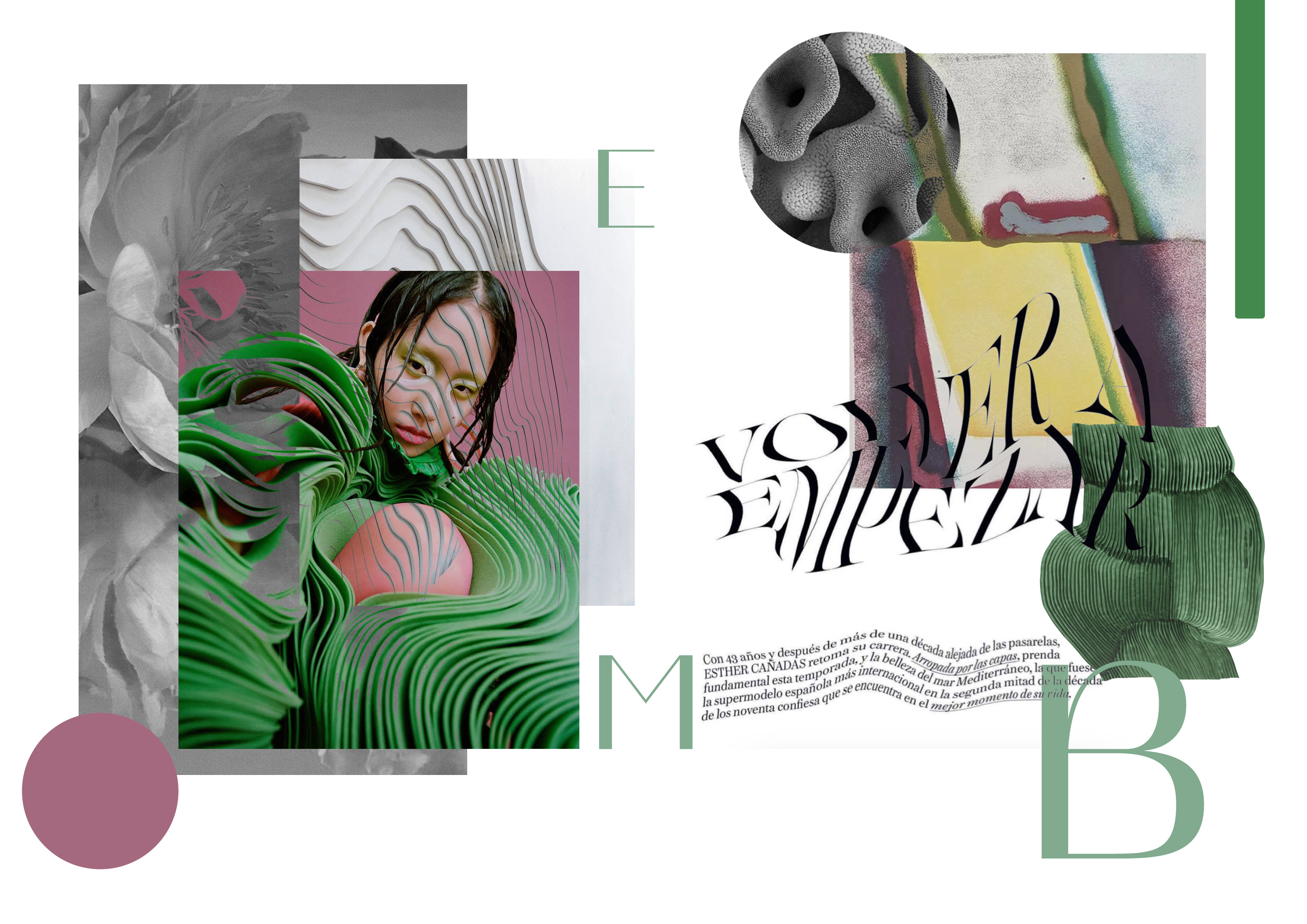
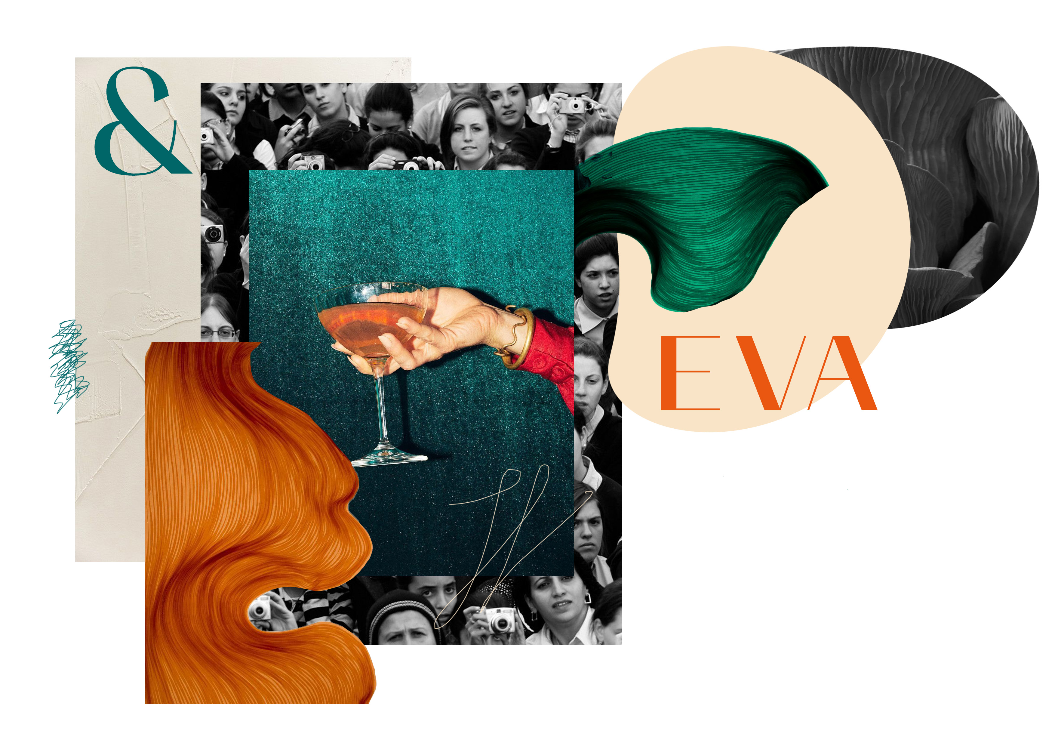
‘Better Late Than Never’
This board suggests an element of old-school luxe, with rich, saturated colours, contrasting against monochromatic textures.
“Better late than never” suggests the element of fusing old-school images and giving them a refresh of modernity.
Old-school
Lavish
Clean
Feminine
Affluent
Established
‘Posh Green Eggs and Ham’
This board showcases my style of visual layout/editorial design. My visuals are often minimalistic, understated, and clean, whilst remaining contemporary in terms of my colour palette and type.
Understated
Minimalistic
Stylish
Sleek
Unpredictable
Editorial
Luxe
Professional
‘Helping Hands’
This board represents my personal style of minimalistic collages, whilst continuing the themes of black and white with accents of colour.
Contemporary
Playful
Bold
Innovative
Multi-media
‘Better Late Than Never’
This board suggests an element of old-school luxe, with rich, saturated colours, contrasting against monochromatic textures.
“Better late than never” suggests the element of fusing old-school images and giving them a refresh of modernity.
Old-school
Lavish
Clean
Feminine
Affluent
Established
Brand Design Recipe
‘(Posh) Green Eggs and Ham’ is the concept behind my personal brand design, which was further translated into a design recipe.
This consisted of several fonts for type and key accent colours. This has been used to design my website, as well as social media logos to ensure consistency and a clear tone of voice across all channels.
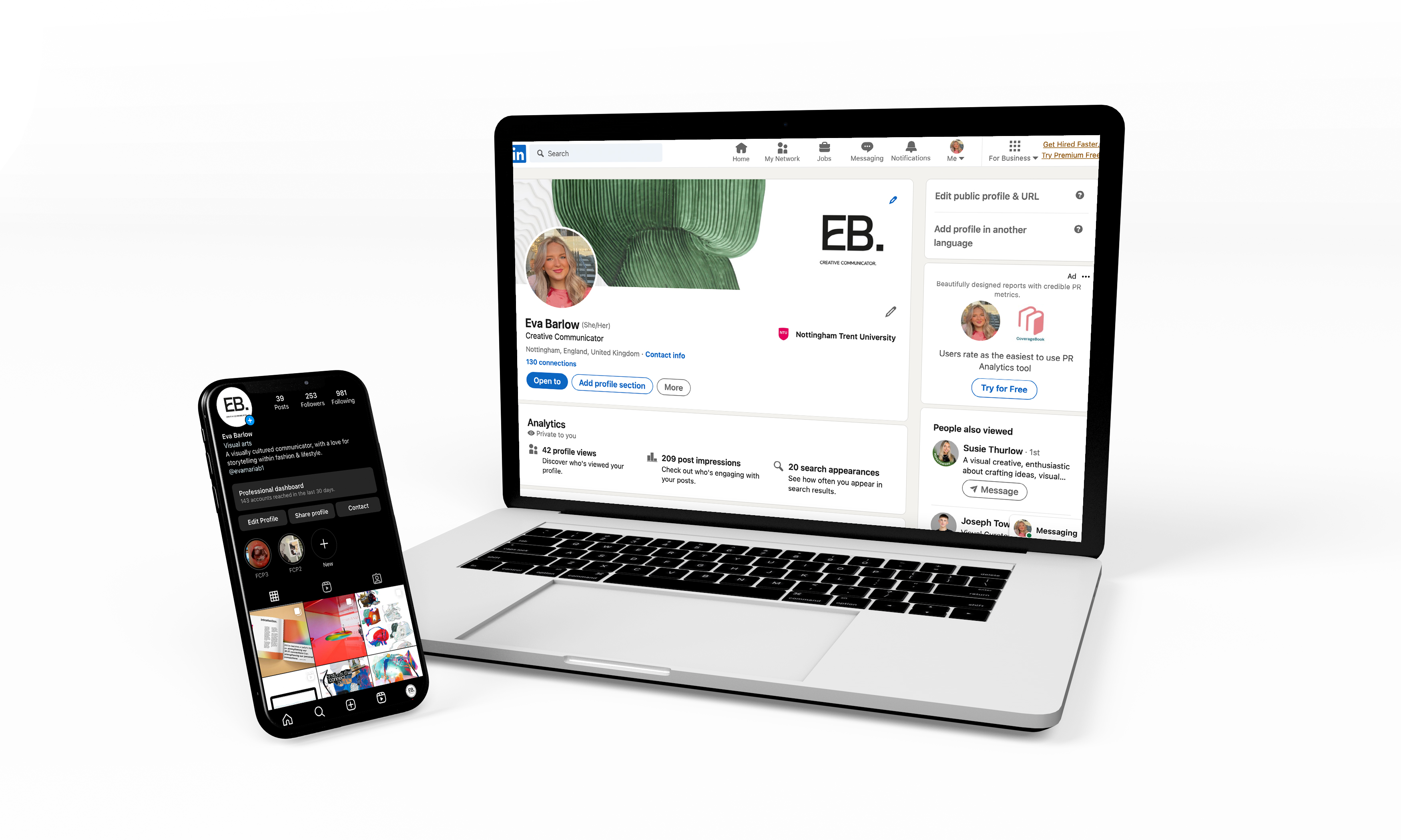
Social Media Logos
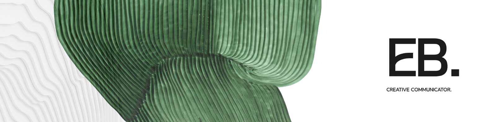
The design is simple and statement, with bold, black type and accents of green shown in the visual for my LinkedIn banner.
A refined logo design which remains consistent and memorable from my website to each social channel. As a creative myself, the work I create tends to be slick and understated and I think these designs mirror that well. It appears mature, yet youthful and contemporary at the same time.
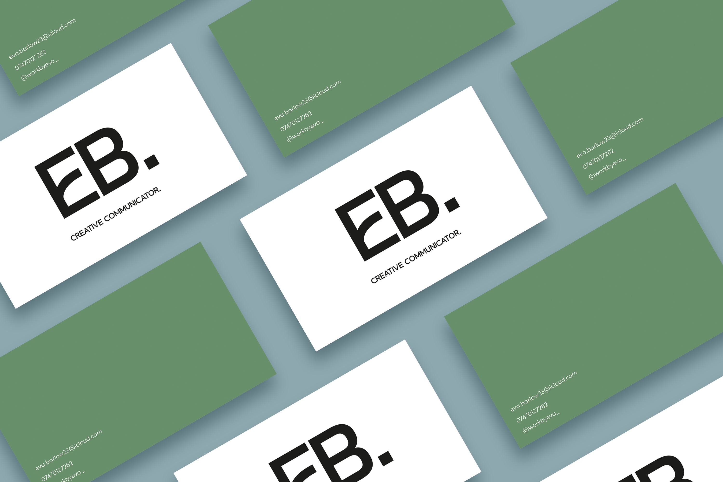
Business card mock-ups
Creating a distinct connection to the rest of my media channels, the cards have been designed consistent with the bold type and accents of colour; the contrast between both sides of the card follows a “quality not quantity” approach, mirroring my personal work ethic.
Creating a distinct connection to the rest of my media channels, the cards have been designed consistent with the bold type and accents of colour; the contrast between both sides of the card follows a “quality not quantity” approach, mirroring my personal work ethic.